
Stories, Guidance, and Real Project Experience from Cambridge and Beyond
Each article is rooted in hands-on experience — drawn from real homes, real planning, and real hurdles overcome.
From poetic reflections to practical how-to guidance, these pieces offer insight into the ideas, decisions, and quiet details behind each space. Whether you're exploring materials, layouts, emotional clarity, or location-specific design, this archive is shaped to be quietly helpful and deeply human.
How Much Does Interior Design Cost In St Albans?
Interior design fees can vary significantly from one project to another. This guide explores what influences the cost of interior design in St Albans and explains the value of professional design thinking, creativity and experience behind every successful home.
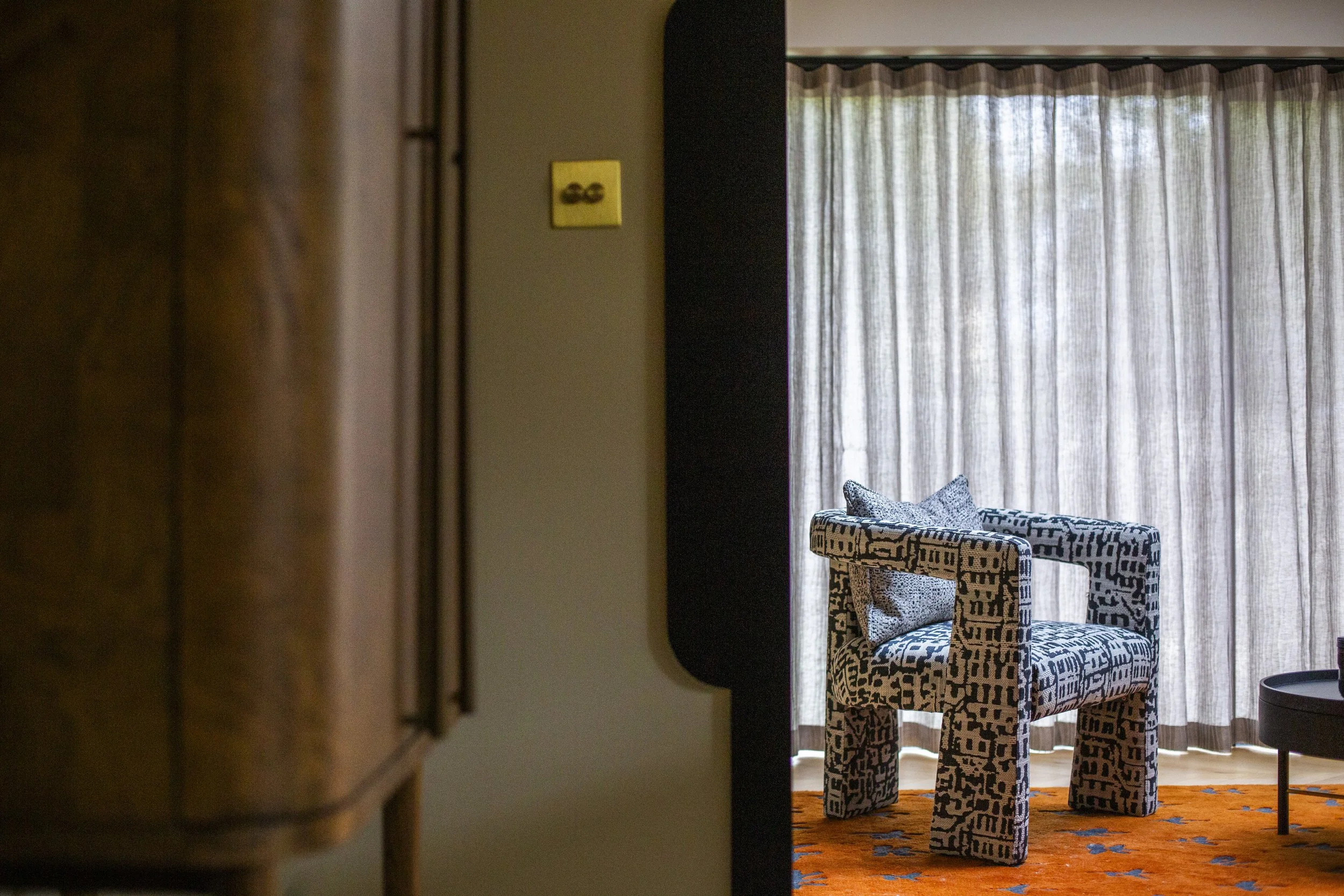
The Invisible Value of Design
Good design often appears effortless. Yet behind every successful interior lies a process of research, creativity, problem-solving and countless decisions. This article explores the invisible value of design and why the thinking behind a project is often its most important contribution.
Why Creative Thinking Has Become The Ultimate Luxury
Excerpt
In a world filled with inspiration images, trends and carefully curated interiors, many homes are starting to look the same. Explore why creative thinking, individuality and thoughtful design have become far more valuable than following a formula.
Why Your Home Feels Disconnected (And It's Not Just The Furniture)
Many homeowners assume a home feels disconnected because of outdated furniture or decoration. In reality, the issue is often the relationship between spaces, layout and how the home functions. Discover why thoughtful planning can transform the way a home feels and flows.

Why Every Home Does Not Need An Open-Plan Layout
Open-plan living has become one of the most popular renovation trends, but bigger spaces do not always create better homes. Discover why thoughtful layouts, flow and functionality often matter more than removing walls.
When Should You Hire An Interior Designer For A Home Renovation?
When is the best time to hire an interior designer for a home renovation? Learn why early collaboration between homeowners, architects and interior designers can improve layout, functionality, flow and long-term enjoyment of your home, whether you're renovating in St Albans, Cambridge or London.
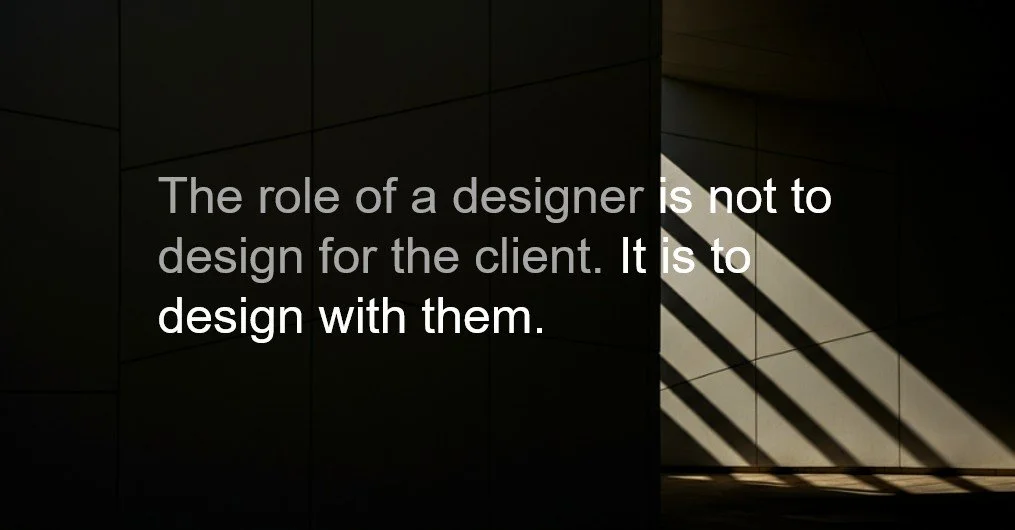
Why Interior Design Is A Service, Not A Product
Interior design is often judged by the finished result, but the real value lies in everything that happens before a project is completed. Discover why great interior design is not simply a product to be delivered, but a collaborative service built around people, relationships and thoughtful decision-making.
Planning A Family Home Renovation In Hertfordshire
Planning a family home renovation involves more than creating additional space. Discover how thoughtful design, careful planning and a clear understanding of how your family lives can help create a home that works beautifully today and in the future.
Renovating A Victorian Home In St Albans: What To Consider Before You Begin
The most successful Victorian renovations do not begin by asking what should be removed. They begin by understanding what makes a home special and how it can continue to evolve for modern living.
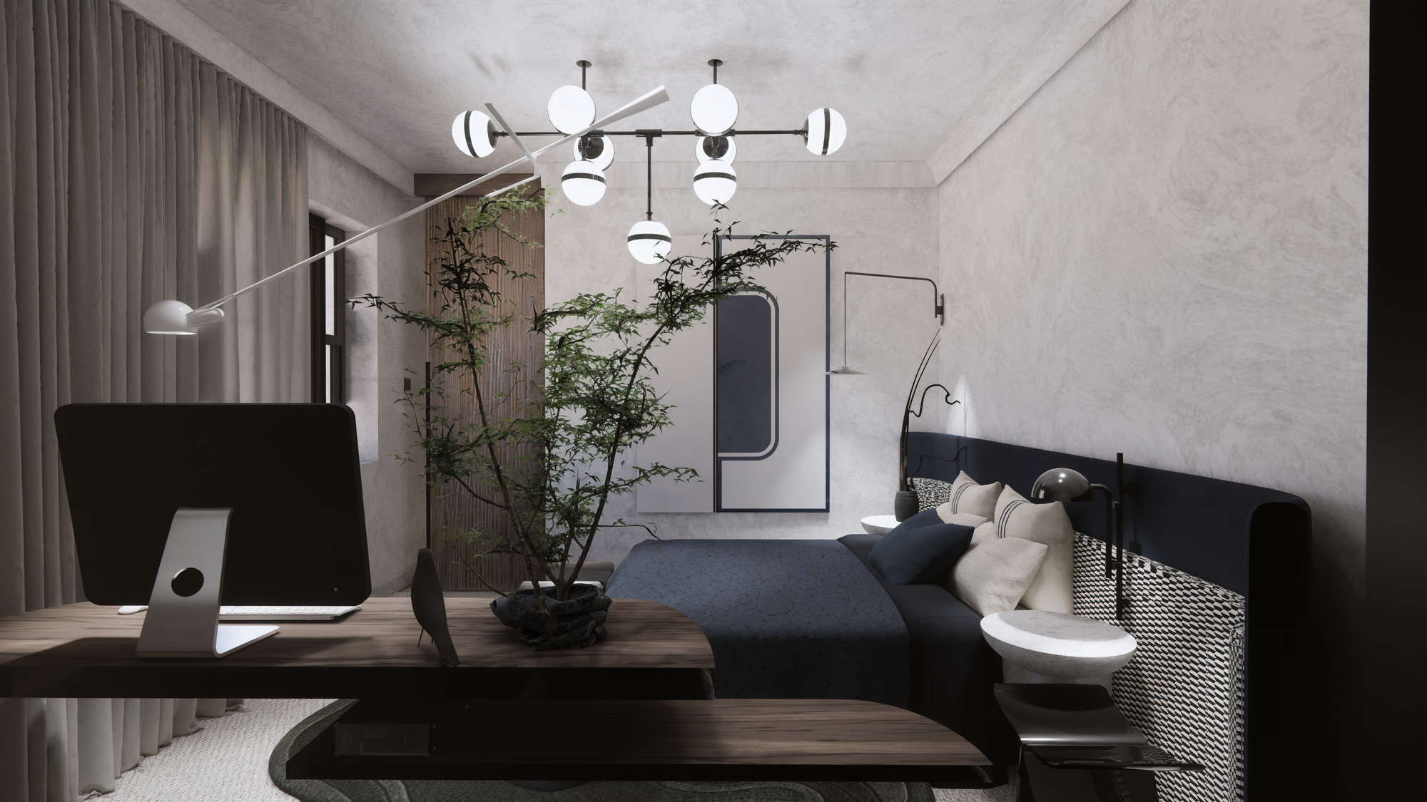
Why Emotionally Intelligent Interiors Are Redefining Modern Luxury
In today’s overstimulated world, luxury is no longer defined by excess or trend repetition. This article explores how emotionally intelligent contemporary interiors are reshaping modern living through calm spaces, thoughtful materiality, and homes designed around real lifestyles, wellbeing, and individuality.
How to Plan Storage in a Modern Home: A Designer’s Method for Calm, Functional Spaces
A guide to planning storage in modern homes, focusing on calm, functional and well-integrated solutions.
Common Awkward Layouts and How to Design for Them
A practical guide to working with awkward layouts, offering clear design solutions to improve flow, function and spatial balance.
How to Design Awkward Room Layouts in Cambridge Homes
Awkward room layouts are common in Cambridge homes, especially in period properties and converted spaces. Discover practical interior design ideas to improve flow, maximise space, and create a more functional home layout.
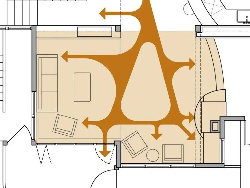
How to Plan Circulation in Open Plan Homes: Creating Flow, Function and Balance
A guide to planning circulation in open plan homes, focusing on flow, movement and creating a balanced, functional layout.
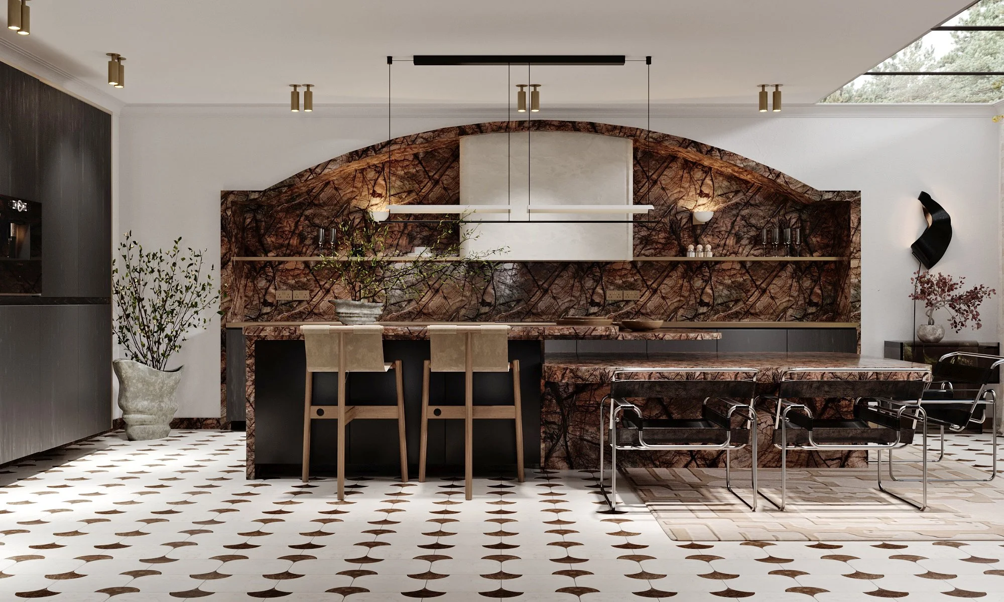
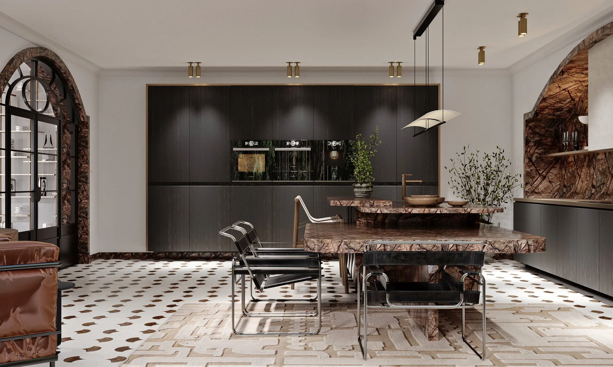
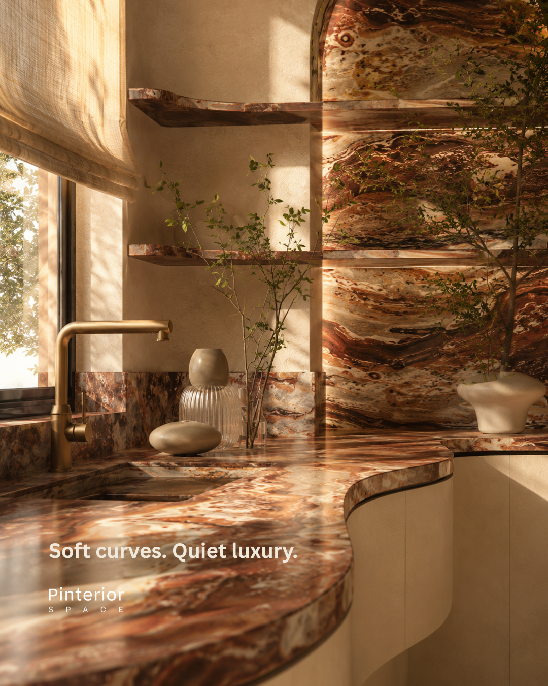
Modern Kitchen Design Mistakes to Avoid in 2026 (And What to Do Instead)
A practical guide to modern kitchen design mistakes and how to avoid them, helping you create a space that is both functional and considered.

Avoiding Costly Renovation Mistakes: A 2026 Homeowner’s Guide to Designing with Confidence
A practical guide to avoiding common renovation mistakes, helping you plan your project with clarity, confidence and long-term value.
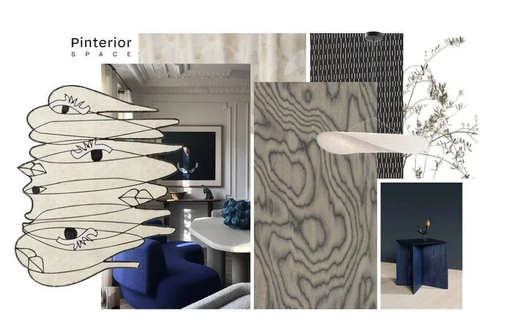
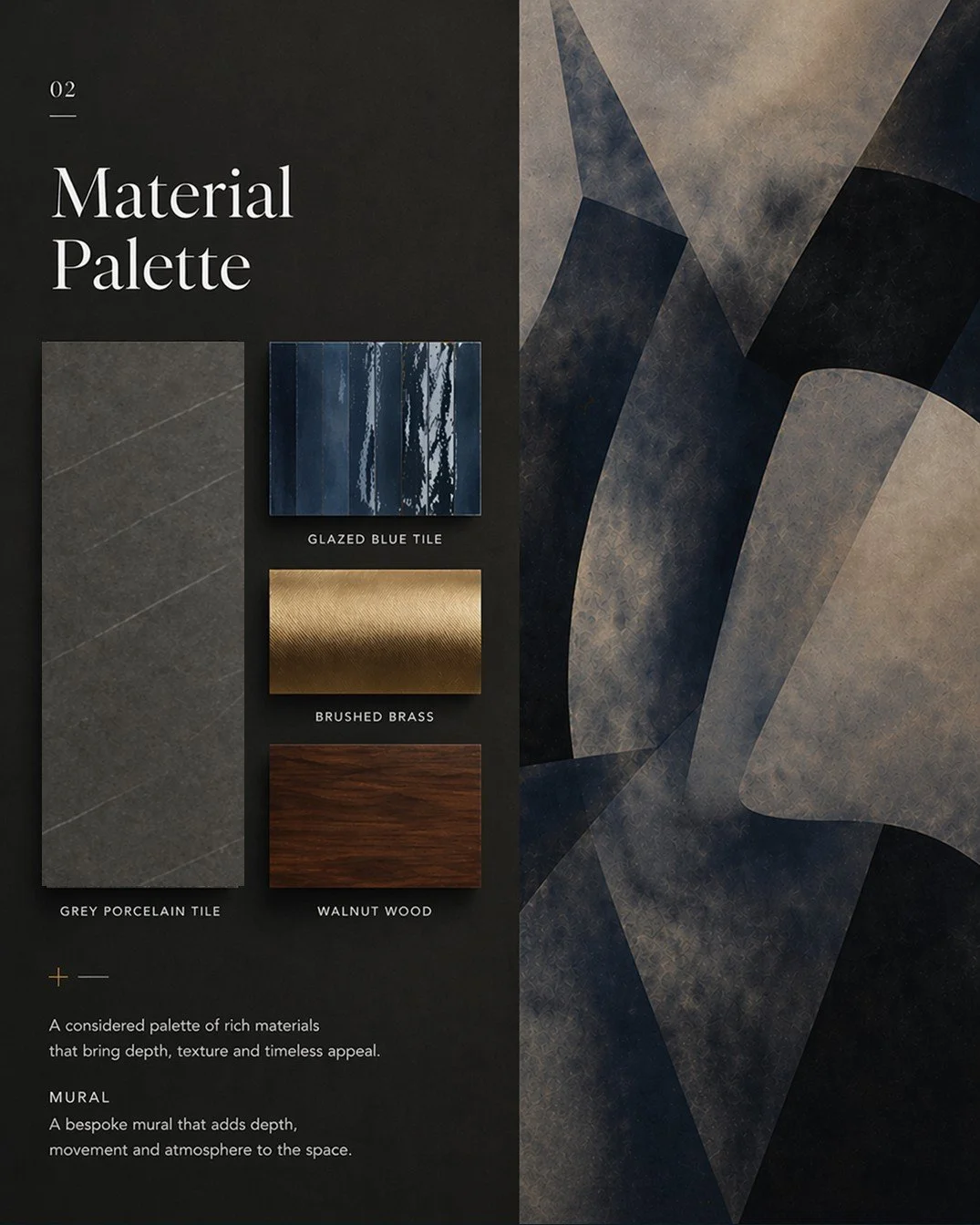
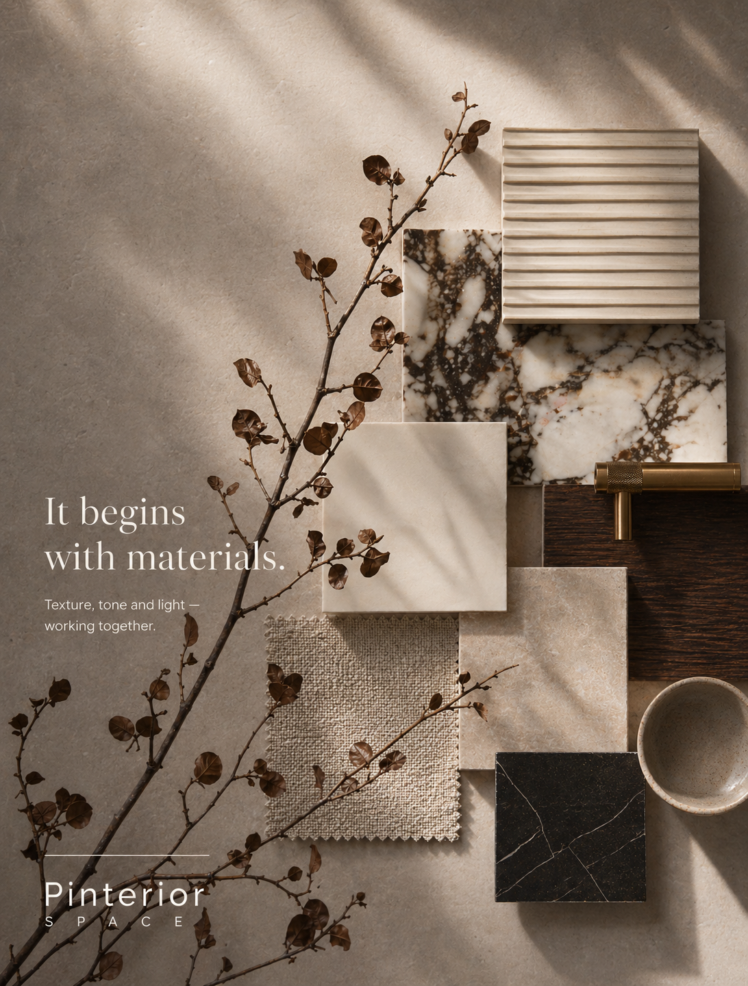
How Interior Design Concept Boards Shape a Project
Interior design concept boards help define the visual direction of a project through materials, colours, textures, and spatial planning. Learn how they create clarity, cohesion, and better design decisions from the start.

Contemporary Interior Design in Holland Park Homes
Discover how contemporary interior design can enhance Holland Park homes through architectural sensitivity, natural materials, calm colour palettes, and thoughtfully balanced living spaces.
Contemporary Interior Design Ideas for London Homes
Explore contemporary interior design ideas for London homes, from small apartments and historic properties to architecturally complex spaces designed for calm, functional modern living.
Interior Designer vs Interior Decorator: What’s the Difference and Who Should You Hire?
A clear guide to the difference between interior designers and decorators, and how to choose the right approach for your home and project.