
Understanding Colour Theory in Interior Design
Colour theory plays an important role in interior design by shaping mood, atmosphere, balance, and the emotional experience of a space. Through thoughtful combinations of colour, natural light, contrast, and material texture, interior design can create homes that feel calmer, warmer, brighter, or more grounded while supporting contemporary living and everyday wellbeing.
Colour theory is the art and science of using colour intentionally. It helps us understand how colours relate to one another, how they interact with light, and how they affect our emotions. Rooted in the colour wheel created by Sir Isaac Newton, it provides a framework for creating balance and beauty.
As a luxury interior designer in Cambridge, I use colour theory to create sophisticated palettes that bring personality and purpose to every room.

Colour wheel - Primary Colour- Secondary Colours- Tertiary Colours. A circular colour wheel displaying primary, secondary, and tertiary hues arranged in sequence, used to explain how designers build harmonious, contrasting, or complementary interior colour schemes.
Understanding the Colour Wheel
Primary colours: Red, blue, and yellow — pure and unmixed.
Secondary colours: Green, orange, and purple — formed by blending primaries.
Tertiary colours: Hybrids like teal and burgundy — created by mixing a primary with a neighbouring secondary.
These combinations set the foundation for expressive, emotionally intelligent design.
Creating Colour Harmony: Three Tried-and-True Approaches
Complementary colours (opposites on the wheel): Think navy and burnt orange. High contrast, high drama.
Analogous colours (neighbours on the wheel): Like olive, forest green, and teal — calming and cohesive.
Monochromatic palettes: Shades and tones of one hue. Clean, minimal, and often quietly luxurious.
I use these principles daily in my Cambridge design practice, especially when rebalancing awkward spaces or introducing flow to open-plan homes.
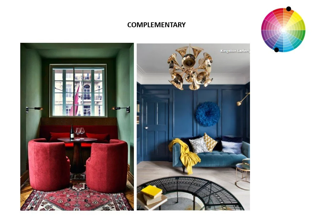
Complementary Colour scheme. A split image shows two interiors demonstrating complementary colour schemes: a dining nook with deep red seating against green walls, and a living room with a blue sofa and wall accented by yellow décor. A small colour wheel highlights the complementary pairs, illustrating how opposite colours create contrast and balance in interior design.
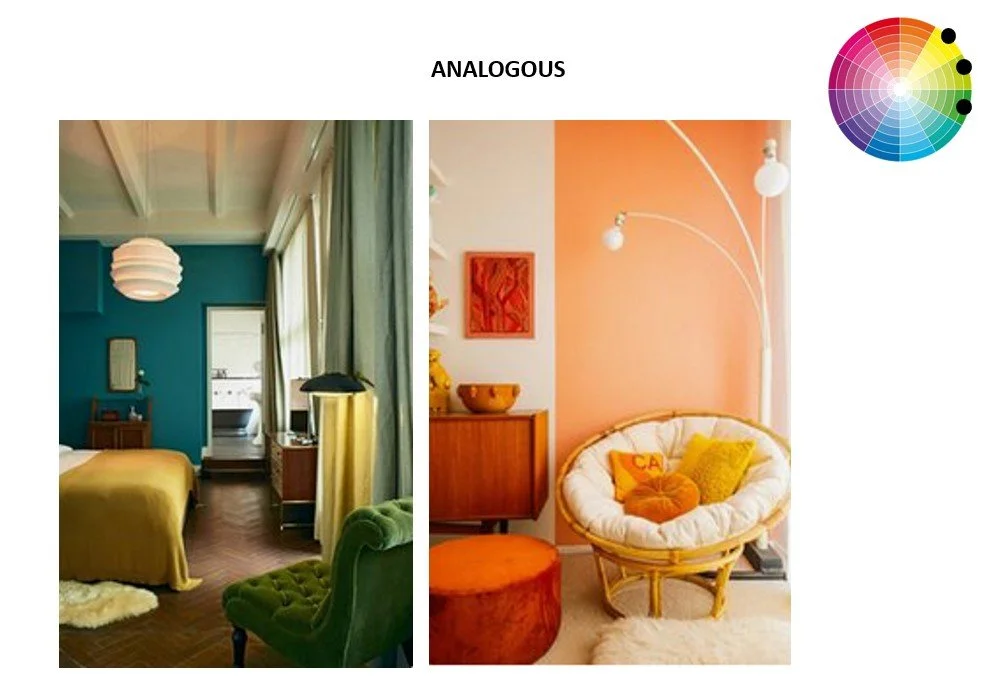
Analogous Colour Scheme. A split image presents two interiors demonstrating analogous colour schemes: one combining teal, mustard, and green tones, and the other blending peach, orange, and yellow shades. A small colour wheel highlights the neighbouring hues, illustrating how analogous palettes create soft, cohesive, and visually calming interior spaces. https://pinterior.squarespace.com/config/pages/6447f386981da30ef22de32e

Monochromatic Colour scheme. A set of three interiors demonstrates monochromatic colour schemes: each room uses one base hue expressed through lighter tints, mid‑tones, and deeper shades. The variations in saturation and value create depth, harmony, and a cohesive visual flow — showing how a single‑colour palette can feel layered and sophisticated in interior design. https://pinterior.squarespace.com/config/pages/6447f386981da30ef22de32e
The Psychology of Colour in Your Home
Colour isn't neutral—it evokes. And that emotional response is where the magic of interior design begins.
Warm tones (think terracotta, mustard, blush) energise and uplift.
Cool tones (like sage, stone, dusty blue) offer calm and clarity.
Deep, rich hues (such as charcoal or forest green) add intimacy and depth—perfect for dramatic dining rooms or moody bedrooms.
As an Interior designer in Cambridge, I consider these emotional effects just as carefully as lighting, materials, and furniture layout.
Why Colour Theory Matters in Cambridge Interiors
Cambridge homes are wonderfully diverse—Georgian terraces in the city centre, new-builds in Trumpington, and converted barns scattered across the Cambridgeshire countryside. And each type of space brings its own colour challenges.
Here's how I use colour theory to bring out the best in local architecture:
Enhancing soft northern light in traditional homes with warm undertones
Creating depth and richness in minimalist new builds with layered neutrals
Highlighting period details without overwhelming them
Reflecting each client’s identity through personalised palettes
This is where a luxury interior designer in Cambridge brings real value—blending creative instinct with technical precision and deep local insight.
My Process: A Collaborative Approach to Colour
No two Cambridge projects are ever the same. That’s why I always begin with a conversation. What colours do you gravitate towards? How do you want to feel when you walk into the room?
From there, we co-create a palette that:
Complements your home’s architecture
Enhances the natural light
Speaks to your personal style
Supports your lifestyle and routines
This tailored, intuitive approach is what sets Pinterior Space apart as a contemporary interior design studio in Cambridge.
Let Colour Tell Your Story
In the end, colour is more than just visual—it’s visceral. It shapes how we experience our homes, and by extension, our lives.
If you’re ready to explore the full potential of colour in your home, I’d love to help. Whether you want to warm up a living space, calm a bedroom, or inject life into your home’s heart—we’ll use colour theory to create something beautiful, timeless, and unmistakably you.
Continue Your Journey
Colour is one of the most influential elements in interior design. It shapes atmosphere, alters our perception of space and affects the way a home feels throughout the day. By understanding the principles of colour theory, you can make confident design decisions that create interiors with harmony, depth and lasting appeal.
Read Next
How to Choose Colours for Your Home (Without Getting It Wrong): A Calm, Practical Guide
Learn how to apply colour theory in your own home with a practical approach to building a cohesive and confident colour palette.
How Natural Light Shapes Interior Design in Cambridge and London
Explore how changing daylight influences the appearance of colour, materials and atmosphere throughout the home.
How Lighting Affects Mood in Interior Design
Discover how colour and lighting work together to shape emotion, comfort and the overall experience of a space.
Return to the Chapter
Learn About Interior Design
Explore the principles behind successful interior design, from colour and materials to light, spatial planning and design thinking. Discover how thoughtful design decisions create homes that are balanced, timeless and deeply personal.