
How to Choose Colours for Your Home (Without Getting It Wrong): A Calm, Practical Guide
Choosing colours for your home can feel overwhelming, especially when you’re worried about making the wrong decision. Many people default to safe choices or delay decisions altogether, which often results in spaces that feel flat or unresolved. In this guide, I explain how to approach colour with clarity and confidence, based on real residential projects across Cambridge and London.
A guide by a local interior designer in Cambridge
Most people don’t fear colour — they fear choosing something they’ll have to live with for years. As an interior designer in Cambridge, I often hear this. Clients across Cambridgeshire villages, London, and nearby towns tell me they’re worried about “getting it wrong,” especially when a room is part of a renovation or a long‑awaited refresh.
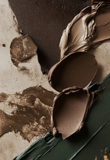
A tactile study in tone and texture. These earthy swatches — from deep green to soft taupe — explore how colour behaves in different finishes. A quiet reminder that choosing colour is about emotion, not just hue.(251) Pinterest
Colour ( If you’d like to understand colour even more deeply, you’re welcome to explore my full Colour Theory Guide.) It’s a calm, friendly introduction to the principles designers use every day — and it pairs beautifully with this article.
becomes easier when you stop guessing and start using a simple, gentle process. This guide is designed to help you choose colours with clarity, confidence, and a sense of calm — even if you’ve never felt confident with colour before.
1. Start with how you want the room to feel
Before you look at a single swatch, ask yourself:
What emotion should this room hold?
Calm? Warmth? Freshness? Sophistication?
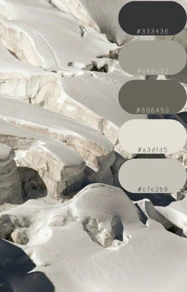
A palette drawn from nature. These soft greys and pale earth tones — sampled from a glacial landscape — offer a quiet, grounded starting point for rooms that need clarity and calm.(251) Pinterest
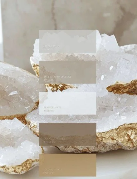
(251) Pinterest. A palette drawn from mineral clarity. These soft greys, warm taupes, and muted golds offer a luxurious starting point for rooms that want to feel grounded, radiant, and quietly refined.
This is the foundation of every project I take on as a local interior designer. Colour is emotional before it’s visual — and when you anchor your choices in feeling, everything becomes easier.
2. Use the colour wheel as a gentle guide
You don’t need to memorise colour theory. You need to understand relationships.
Tonal harmony (the safest choice)
Colours from the same slice of the wheel — soft blues, blue‑greens, greys.
Perfect for calm, contemporary homes in Cambridge and London.
Analogous palettes (designer favourite)
Three neighbours on the wheel — green, blue‑green, blue.
Layered, elegant, and almost impossible to get wrong.
Complementary contrast (gentle energy)
Opposites — like blue and soft ochre.
A subtle lift without chaos.
These are not rules — they’re starting points that remove fear.
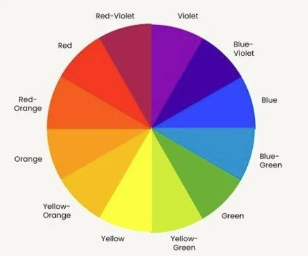
A simple tool with powerful clarity. The colour wheel helps us understand how hues relate — guiding tonal harmony, gentle contrast, and confident palettes for every room
3. The 60‑30‑10 rule
This is the simplest way to stop colour from feeling overwhelming.
• 60% — main colour (walls, large furniture)
• 30% — supporting colour (curtains, joinery, rugs)
• 10% — accent (art, cushions, lamps)
For very calm interiors — especially in period homes around Cambridgeshire — the 90‑60‑10 variation works beautifully.
4. Don’t forget the skirting, architraves, and ceiling
This is where most people go wrong.
Skirting & architraves
• Same colour as the wall → calm, elongated, modern
• Darker → grounded, architectural
• Lighter → crisp, traditional
Ceilings
A soft tint of the wall colour can make a room feel taller and more cohesive.
A bright white ceiling can sometimes feel disconnected.
These details are small, but they’re exactly what people look for when searching for an interior designer near me — someone who sees the whole picture.
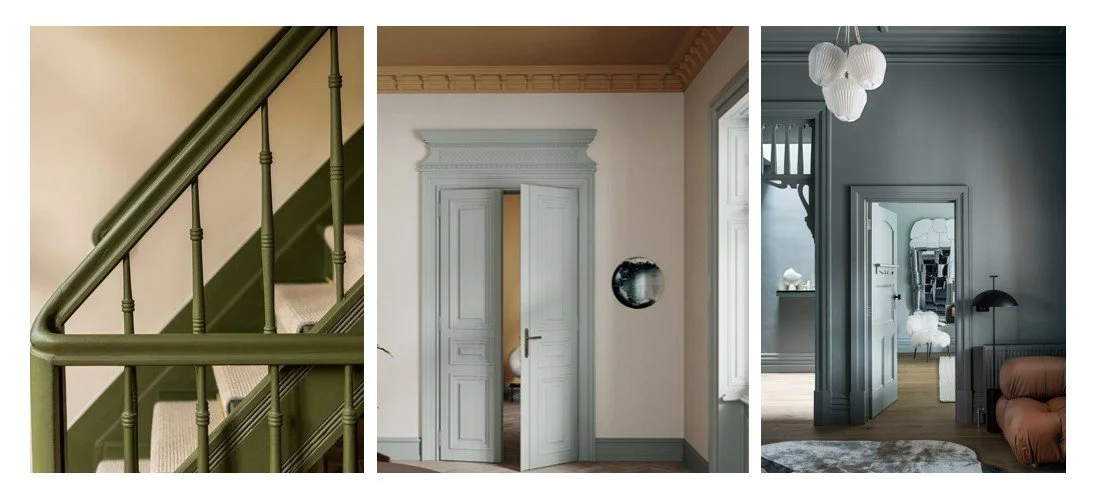
Colour lives in the details. These interiors show how painted skirting, architraves, and ceilings can shape the mood of a room — grounding, elongating, or softening the space with quiet confidence. (251) Pinterest
5. Build a sample board — your secret confidence tool
This is the step most homeowners skip, and it’s the one that changes everything.
Gather:
• paint samples
• flooring
• fabrics
• joinery finishes
• metal details
• wallpaper
• tiles
• even a photo of the room’s natural light
Lay them out together.
This is how I work on every project, whether I’m designing for a home in Cambridge, a renovation in a Cambridgeshire village, or a London townhouse. A sample board shows you how colours behave together, not in isolation — and that’s where confidence comes from.
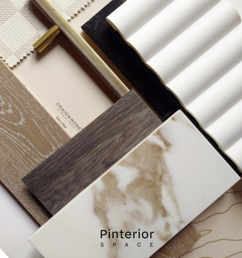
A sample board brings clarity. These layered materials — from soft textiles to sculpted surfaces — show how colour and texture behave together. A quiet reminder that confidence comes from testing, not guessing
6. Choose colours that support the architecture
A Victorian terrace in Cambridge wants different tones than a new‑build in Eddington or a modern home in London.
Not rules — just rhythms.
Here are some style‑based palettes that help beginners feel grounded:
• Modern Calm — soft greys, muted blues, natural textures
• Warm Minimalism — clay, sand, muted terracotta
• Contemporary Classic — navy, ivory, brass, walnut
• Scandi Light — chalk white, pale oak, dusty greens
• Mid‑Century Warmth — mustard, walnut, teal
These give you a safe starting point without limiting creativity.
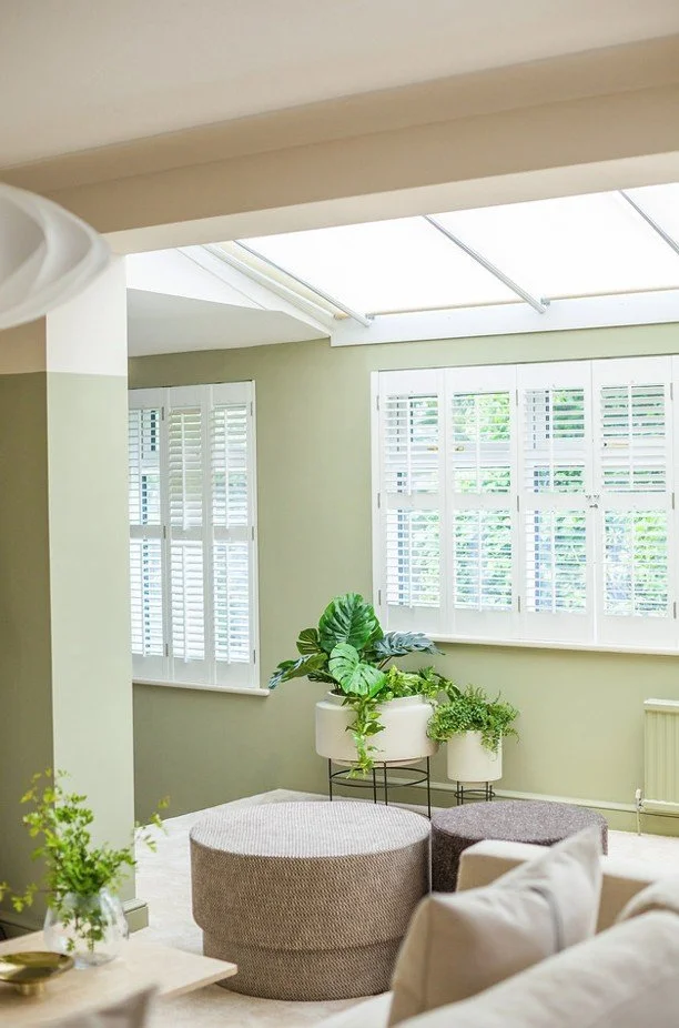
Colour should support the architecture. In this light-filled room, soft greens and natural textures enhance the rhythm of windows, ceiling height, and daylight — creating a space that feels both fresh and grounded.
7. Test colours in real light
Screens lie.
Tiny swatches lie.
Light tells the truth.
Paint large samples.
Move them around the room.
Check them morning and evening.
Hold them next to the flooring, fabrics, and joinery.
This is the step that separates “guessing” from designing — and it’s the reason people hire an interior designer in Cambridge or London when they want certainty.
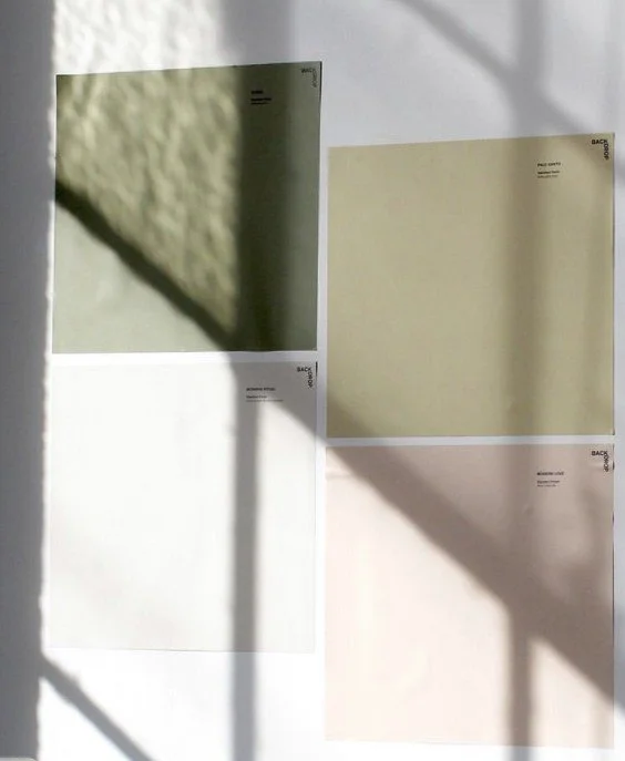
Colour changes with light. These swatches — tested directly on the wall — reveal how undertones shift across the day. A quiet reminder that confidence comes from seeing colour in context. (251) Pinterest
8. When in doubt, go tonal
A tonal palette is calm, elegant, and almost impossible to get wrong.
It’s the approach I use in many Cambridge renovations where clients want a timeless, quietly confident home.
9. You don’t have to do it alone
If choosing colours still feels overwhelming, that’s completely normal.
Designers don’t guess — we test, refine, and build palettes that support the architecture and the way you want to feel in your home.
Choosing colours doesn’t have to feel overwhelming. If you’d like support creating a palette that feels calm, cohesive, and true to your home, I’d be glad to support you. Whether you’re based in Cambridge, one of the surrounding villages, or London, you’re welcome to get in touch — sometimes a conversation with a designer is all it takes to turn uncertainty into clarity.
Ready to design with intention? Book your free consultation today.
Continue Your Journey
Choosing colours is about much more than selecting a favourite shade. Understanding how colour interacts with light, materials and the way you live helps create interiors that feel calm, balanced and personal. Once you begin thinking about colour as part of the overall design, every decision becomes more confident.
Read Next
Understanding Colour Theory in Interior Design
Discover how colour harmony, contrast and balance influence the atmosphere of a room and help create interiors that feel cohesive and considered.
How Natural Light Shapes Interior Design in Cambridge and London
Explore how natural light transforms colours throughout the day and learn why lighting is one of the most important considerations when choosing a colour palette.
How to Create an Interior Design Concept Board
See how colours, materials, textures and furnishings come together to create a clear and cohesive design direction before any major decisions are made.
Return to the Chapter
Learn About Interior Design
Explore the principles behind successful interior design, from colour and lighting to spatial planning and design thinking, and discover how professional designers create homes that feel balanced, functional and timeless.