
How to Design Balanced and Well-Proportioned Interior Spaces
Proportion plays a fundamental role in creating interior spaces that feel balanced, calm, and architectural. From furniture scale and ceiling height to spatial flow and material distribution, thoughtful proportion helps modern interiors feel more cohesive, functional, and visually comfortable to live in.
Explore Related Guides
By Pavlina — Interior Designer in Cambridgeshire, Cambridge & London
Proportion is the quiet force that makes a room feel inevitable — as if it could not exist in any other configuration. Long before colour palettes and furniture plans, architects like Aalto, Breuer, Le Corbusier, and Mies shaped space through ratios, rhythm, and restraint. Their work reminds us that a room becomes truly beautiful not through decoration, but through relationships: between solids and voids, light and shadow, mass and air.
As alocal interior designer working across Cambridge, Cambridgeshire, London, and Welwyn Garden City, I see proportion as the foundation of every project — from whole‑home refurbishments to kitchen and bathroom interior design. It’s the difference between a room that feels styled and a room that feels composed. Whether I’m designing full homes or refining individual spaces through my [interior design services → /services].
“Architecture is the learned game, correct and magnificent, of forms assembled in the light.” — Le Corbusier
Why Proportion Matters More Than Style
Style dates a space.
Proportion anchors it.
A well‑proportioned room feels calm even when sparsely furnished. It carries an internal logic — a sense of order the eye recognises before the mind names it. This is why modernist interiors still feel contemporary: their power lies not in geometry, alignment, and spatial rhythm.
When proportion is right, everything else becomes easier.
When it’s wrong, no amount of styling can save it.
This is the principle I return to again and again as an interior designer near me, search result for many clients seeking clarity, calm, and architectural coherence.
If you’re exploring how proportion shapes real homes, you can browse my [Cambridge residential projects → /cambridge-projects].
Proportion is never just about the size of individual pieces — it’s shaped by how the space is planned as a whole. This is why it forms part of a wider approach to space planning in interior design, where layout, flow and balance are considered together.
1. Rhythm: The Architecture of Repetition
Aalto used rhythm the way composers use tempo — repeating verticals, softening corners, spacing elements so the eye moves gently across a room. Rhythm is not symmetry; it is measured variation.
In interiors, rhythm emerges through:
aligned sightlines
repeated materials
consistent spacing
a hierarchy of vertical and horizontal lines
Breuer’stubular steelfurniture is a masterclass in this: repetition creates coherence, even in a minimal room.
“God is in the details.” — Mies van der Rohe
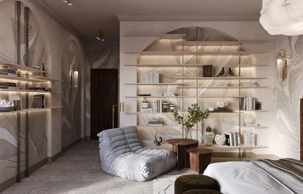
This bedroom composition demonstrates architectural rhythm through repeated verticals, curved shelving, and evenly spaced elements. Backlit niches, aligned sightlines, and a restrained palette guide the eye in a gentle, measured flow — a contemporary echo of Aalto’s belief that rhythm is the quiet architecture of a room.
If you’d like to see how rhythm and alignment appear in real projects, visit my [portfolio → /projects].
2. Negative Space: The Luxury of What You Don’t Fill
Quiet luxury is not about expensive materials; it’s about restraint.
Mies van der Rohe understood this better than anyone. His rooms breathe because he allowed emptiness to carry weight.
Negative space:
frames the objects you choose
clarifies circulation
creates visual rest
amplifies natural light
A room with generous negative space feels confident. It signals that the designer trusts the architecture — and doesn’t need to over-explain.
This principle is especially powerful in kitchen and bathroom interior design, where clarity and flow matter as much as beauty. You can explore examples in my [kitchen and bathroom projects → /kitchens-bathrooms].
If you’d like to see how quiet luxury translates into real Cambridge homes, you can explore my [Cambridge residential projects → /cambridge-projects]. Quiet luxury is not minimalism; it’s intentional simplicity — every line, surface, and junction considered.
3. Light as a Proportional Tool
Light is not an afterthought; it is a structural element.
Le Corbusier treated light as a material, carving openings with precise ratios so illumination fell exactly where it mattered. In interiors, light shapes proportion by:
elongating or compressing walls
defining focal points
revealing texture
creating gradients that soften geometry
“Light creates ambience and feel of a place, as well as the expression of a structure.” — Le Corbusier
A well‑proportioned room uses light to sculpt mood, not merely to brighten.
For projects where light becomes the primary design tool, you can explore my [articles: How to Layer Light Like a Designer→].

A contemporary interior with a vertical brass wall light featuring three evenly spaced opal globes. The fixture sits on a clean white wall beside a window and a glazed door, casting soft illumination that elongates the wall and highlights the room’s refined proportions. Light, texture, and geometry work together to create a calm, sculpted atmosphere.
4. Human Scale: Designing for the Body, Not the Camera
Proportion is ultimately about how a room feels when you inhabit it.
Modernist masters designed for movement — how a person sits, stands, turns, and approaches a window. A space can photograph beautifully yet feel wrong in person if the scale ignores the body.
Consider:
seat heights and depths
the distance between furniture pieces
artwork at true eye level
the thickness of frames, plinths, and edges
When scale honours the body, the room feels instinctively right.
If you’re curious how human scale shapes lived spaces, you can explore my [family homes and lived‑in interiors → /family-homes].
5. The Architectural Interior: Where Design and Architecture Meet
Architectural interiors are not decorated; they are composed.
They rely on:
proportion
alignment
material honesty
structural clarity
light as a design partner
This is the foundation of quiet luxury — not opulence, but precision.
A room becomes architectural when every element participates in a larger spatial logic. Nothing is arbitrary. Everything is intentional.
This is the approach that defines my work as a Cambridge interior designer and as a local interior designer for clients across Cambridgeshire and London.
You can see this approach in practice in my [projects → interiors].
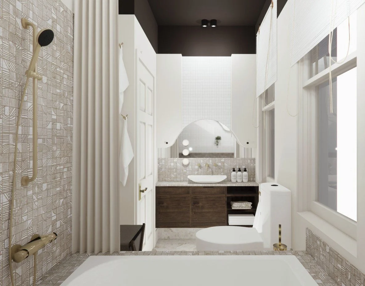
A recently completed London bathroom designed with an architectural approach: geometric bath tiling, a sculptural mirror, and a warm timber vanity arranged with precise alignment. Soft globe lighting, layered textures, and a calm neutral palette create a composed, proportion‑driven interior where every element participates in the spatial logic.
How to Apply These Principles in Your Own Projects
Observe
Trace the room’s natural lines. Where does the eye want to go?
Reduce
Remove one object. Then another. Notice how the space recalibrates.
Align
Choose one dominant axis — a window, a beam, a fireplace — and let it guide placement.
Balance
Pair mass with void, height with horizontality, texture with smoothness.
Refine
Adjust spacing by centimetres, not metres. Proportion lives in the small shifts.
If you’d like support applying these principles to your own home, you can learn more about my [design process → /process].
The Designer Who Thinks in Proportion Thinks Like an Architect
This is where your authority shines.
Proportion is not a trend; it is a discipline.
It is the difference between interiors that feel momentary and interiors that feel timeless.
Rooms designed with proportion at their core don’t just look balanced — they feel inevitable, quietly luxurious, and deeply architectural.
“Always design a thing by considering it in its next larger context.” — Eliel Saarinen
If you’re beginning a project and want to explore proportion‑led design, you can start with my [interior design services → /services].
If you’re exploring how to bring this kind of clarity, proportion, and modern design philosophy into your own home — whether you’re in Cambridge, Cambridgeshire, the surrounding shire villages, London, Letchworth, Hitchin, St Neots, or nearby — I’d love to help you shape a space that feels calm, intentional, and deeply supportive. You can learn more about working together or get in touch through my Contact page, where every project begins with a thoughtful conversation.
Continue Your Journey
Balance and proportion are just two of the principles that shape successful interiors. Continue exploring these articles to discover how thoughtful design decisions create homes that feel calm, functional and beautifully composed.
Read Next
Space Planning Ideas for Contemporary Homes in Cambridgeshire
Discover how professional designers evaluate a space and uncover opportunities that aren't always immediately visible.
The 8 Essential Elements of Interior Design Explained
Explore the core principles that work together to create balanced, timeless and well-designed interiors.
Understanding Colour Theory in Interior Design
Learn how colour relationships influence balance, harmony and the overall experience of a space.
Return to the Chapter
Interior Design Styles & Ideas
Explore more articles about design principles, interior styles and the ideas that shape calm, contemporary homes.